Starting them anywhere else — truncating the y-axis — risks misleading your audience by making a small difference look like a big one.
Yet many experts agree that while the baseline zero rule is pretty much ironclad for bar charts, it doesn't necessarily apply to other chart types. And, in particular, it doesn't always apply to line charts.
The argument is that because bar charts encode data by length, truncating the axis naturally misleads your audience. In contrast, line charts encode by slope or position, so baseline zero isn't as important.
But I'm not so sure about that.
Here's an example.
When people talk about how how truncating the y-axis can make a bar chart misleading, it usually doesn't take too long before this infamous chart from Fox News comes up.

But let's imagine that, instead of a bar chart, Fox had used a line chart instead.

Isn't that chart misleading, too? I would say yes. And I think it's because — while bar charts and line charts are clearly different — I'm not sure that the average reader interprets them that differently.
In my personal experience, and what I've observed in others, people "decode" a line chart in much the same way they decode a bar chart: By the distance of the mark from the baseline. Which means a line chart with a non-zero baseline poses a similar risk of misleading people as a non-zero bar chart.
This isn't an original idea. In a 2013 blog post on baselines, Robert Kosara said he thinks baselines can be important on both bar charts and line charts:
Some people suggest that in contrast to bar charts, line charts are not sensitive to the baseline problem. However, I disagree. Look at the same data as before, this time shown as a line chart.

Is the change not much more dramatic in the right-hand part of this image? The line chart maps the value to vertical position rather than length, which is less obviously connected to the axis [than bar charts]. But when the points are connected, we tend to think in terms of the distance from the axis, not in terms of a few points floating in space.
Line charts with a non-zero baseline are very common. They are still problematic, however, because the apparent change can be deceiving. Having to look at the numbers on the axis to figure out the amount of change requires a lot more mental work and partly defeats the point of the chart.
And, indeed, there's some preliminary empirical evidence to back up the idea that truncating the axis is a problem on line charts, too.
A 2015 research paper looked at how various "deceptive" charts affected the way people perceived the message in a data visualization.
For example, people were shown two bar charts and asked how much bigger one bar was than the other on a 5-item Likert scale from "slightly better" to "substantially better". (The charts shown here are examples from the paper; the actual ones tested were somewhat different.)

Not surprisingly, people were more likely to say the difference was substantial when the y-axis was truncated.
The study didn't specifically look at truncated y-axes for line charts. But it did look at line charts with a distorted aspect ratio, which has a very similar effect (as changing the aspect ratio, like truncating the axis, can make a line look more or less steep).

Interestingly, the study found readers were also misled by the distorted line chart. And, in fact, the gap between the control and the deceptive line chart was greater than it was for the bar charts.

As Enrico Bertini, one of the paper's authors notes, the values used in the bar and line charts were not the same, and so we can't really compare them directly to each other.
But this provides at least some evidence that the concerns we have about bar charts — that truncating the y-axis can mislead people — could also apply to line charts.
It's important to note that, for all the charts used in the "deceptive" charts study, the actual numbers were visible on the charts (as in the examples above). So participants were misled even though the axes were properly labelled. This is an important point, I think, as people often dismiss concerns about truncated axes (on bar charts or line charts) by arguing a chart is honest as long as the axes are labelled. As David Yanofsky wrote in Quartz:
Blaming a chart’s creator for a reader who doesn’t look at clearly labeled axes is like blaming a supermarket for selling someone food he’s allergic to.It's an interesting analogy as, when it comes to food allergies, schools, restaurants and stores now go out of their way to alert people to possible allergens, believing their moral duty to prevent harm is greater than just listing "peanuts" in tiny type on the ingredients list.
While the stakes are (thankfully) not nearly as high when it comes to charts, I think chart creators should also go out of their way to avoid harm. We don't want our charts to mislead people, including those who don't look carefully at the axis.
I know of no evidence to suggest that non-zero bar graphs are interpreted any differently than non-zero line graphs or dot plots. Every argument that could be made about the height of a bar could be made about the vertical position of a point.— Steve Haroz (@sharoz) May 24, 2018
We don't know what visual cue people use or how they reason with it. Could be length. Could be area. Could be position of the top of the bar. And not clear why a point's distance from the x-axis is different from the length of a bar. There are plausible options, but no evidence.— Steve Haroz (@sharoz) May 24, 2018
So does that mean line charts, like bar charts, should always start at zero?
I don't think that's right, either.
Because it's not hard to find examples where a rigid baseline-zero rule for line charts leads to data visualizations that are totally useless.
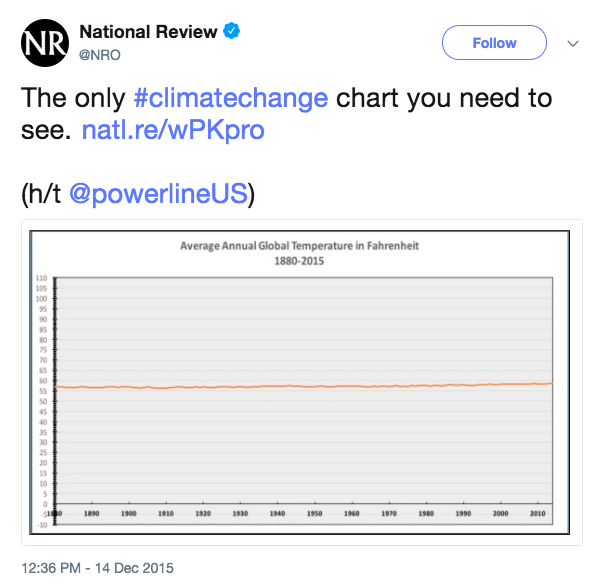
You can make global warming look like no big deal if you stick to baseline zero (as the National Review did).
Intraday stock charts are another good example. A very small change in a stock price (i.e. up or down a few percent) may be very meaningful if it's meant to show how the market reacted to news about a company. Like this chart showing what happened to Apple stock after the celebrity photo hacking scandal:

Or let's say you have an expensive diagnostic machine in a hospital that will break down if a certain fluid goes above or below a given level. A "control chart" that shows if operations are within a narrow acceptable range is clearly the right answer. Should we risk letting the machine break down just so the baseline-zero crowd are happy?

The bottom line is that sometimes small changes are really important. And if baseline zero makes those small changes invisible, or really hard to see, that's not ideal.
But in many other cases, the important changes are of large or medium size and are easy enough to see using baseline zero. All truncating the axis does in those cases is make those changes look (misleadingly) much bigger than they really are.
For example, this line chart of "Breaking Bad" star Aaron Paul's Twitter followers clearly shows there was a spike in followers during the final season.

Using baseline zero doesn't make the trend hard to see and, I would argue, makes the chart more informative as it gives both a sense of when his followers started to spike and an accurate picture of how big that recent growth in followers really is (~40% increase).
All truncating the y-axis does is make that growth look much, much more dramatic than it really is. It provides the reader with less information, not more.

It strikes me that line charts are communicating (at least) two things.
One is the rate of increase/decrease relative to earlier points on the chart. For example, a big shift in a stock's price immediately following a major news event. Or how crime went up faster between November and December than between July and August. For these types of comparisons, baseline zero is irrelevant.
But a line chart is also often communicating the actual rate of increase/decrease (ie. up 25%, down 50%). And for this, baseline zero can be very important (and its absence potentially misleading).
While more research in this area would be helpful, I'm inclined to think that both these things are probably true:
- Truncating the y-axis on a line chart, like on a bar chart, risks misleading your audience into thinking a change is bigger than it really is.
- Sometimes that risk is worth it to make sure your audience is able to see small, but meaningful, changes in the data.
Most line charts should start at zero.When I floated this idea on Twitter, Alberto Cairo came up with a slightly different rule of thumb:
BUT not using baseline zero is OK if:
a) Zero on your scale is completely arbitrary (ie. temperature) OR
b) A small, but important, change is difficult or impossible to see using baseline zero.
Here's how I approach this:
1. If you can include 0 and there's a natural 0, include 0.
2. If by including 0 your line becomes so flat that you barely see differences, then it's wrong and misleading
3. The main purpose of a line chart is to see differences, not to tell how far it is from 0 as a whole (that can be a purpose, too, but a secondary one, and subject to fulfilling the former.)
4. All these depend on the nature of the data
These are good guidelines. And certainly better, in my view, than "the baseline doesn't matter at all on a line chart". But I take issue with a couple of Alberto's points.
First, to Point 3, I'm not sure the fundamental purpose of a line chart and a bar chart are necessarily that different.
Indeed, when I encounter charts in the wild (in news stories or business reports), the main thing that sets the two apart is just the type of data being represented: categorical data is usually shown on a bar charts, time-series data is usually shown on a line chart.
For example, homicide rates between major cities would typically be shown on a bar chart, while the change over time in the homicide rate for a particular city would be shown on a line chart. But what's being compared — the homicide rate — is the same in both cases. And what defines a meaningful difference (between a violent city and a safe one, or how much safer a city has become over time) is the same, too.

On Point 2, I'm also not sure I'm completely sold on the idea of a "natural 0". I've asked Alberto what he would consider an "unnatural zero" — meaning baseline zero isn't required — and he has said he defines it as situations where the data being visualized is unlikely to ever hit zero. Unemployment will never be at 0%. A nation's life expectancy will never be 0 years.
Yanofsky made a similar point in his a Quartz piece, arguing baseline zero is "worth omitting when the implication that [the data] might reach zero is preposterous".
And Stephanie Evergreen made a similar argument in a post last year.
First, to Point 3, I'm not sure the fundamental purpose of a line chart and a bar chart are necessarily that different.
Indeed, when I encounter charts in the wild (in news stories or business reports), the main thing that sets the two apart is just the type of data being represented: categorical data is usually shown on a bar charts, time-series data is usually shown on a line chart.
For example, homicide rates between major cities would typically be shown on a bar chart, while the change over time in the homicide rate for a particular city would be shown on a line chart. But what's being compared — the homicide rate — is the same in both cases. And what defines a meaningful difference (between a violent city and a safe one, or how much safer a city has become over time) is the same, too.

Yanofsky made a similar point in his a Quartz piece, arguing baseline zero is "worth omitting when the implication that [the data] might reach zero is preposterous".
And Stephanie Evergreen made a similar argument in a post last year.
Other than for bar charts, I advocate for a y-axis that is based on something reasonable for your data. Maybe the minimum of the axis is your historically lowest point. Maybe the minimum should be the point at which you’d have to alert your superiors. Maybe the minimum is the trigger point where your team has decided a different course of action is needed. Whatever you pick, just pick. Make it meaningful and intentional. Not something the software automatically decides for you (though that’s a place to start your thought process).And, indeed, Alberto used the "natural 0" argument to make a case for why my hypothetical Fox News line chart above is misleading even though many line charts with a non-zero baseline aren't:
No. See the other tweets where I explain how to choose a reasonable baseline: historical minimum in this case, for instance: 0% (before 1913 there was no income tax in the U.S.)— Alberto Cairo (@albertocairo) May 24, 2018
The idea of a meaningful, natural baseline for a line chart is appealing. But I'm not sure it makes sense in practice.
If most of your audience doesn't know that the U.S. had no income tax prior to 1913 — and I would hazard a guess that most of them don't — then how can that fact be relevant to whether a chart is misleading or not?

Or, to put it another way, if this was a chart of income taxes in a country that had always had high income-tax rates (Norway, maybe?) would that suddenly make it OK to have the y-axis start at 34%? Would the line chart no longer be misleading? I don't think so.
I think Alberto and Stephanie's argument for a "natural" baseline other than zero — whether a historical minimum, or "trigger point" where action needs to be taken — only makes sense if the baseline is annotated with that contextual information. Then, the "natural" baseline is providing useful context.

But a line chart that uses a "natural" baseline with which the audience is unfamiliar won't be any less misleading, in my view, than one that uses an arbitrary cut-off.
Also, even in situations where zero is never reached, it's a useful benchmark to be able to see what the real rate of change is.
An increase in unemployment from 4% to 8% is a doubling of unemployment, even if unemployment will never reach zero. And a drop in mortgage rates from 8.5% to 5% is not quite as dramatic as this chart makes it look, even if banks will never loan out money for nothing.

All of which, in my view, supports the argument that most line charts should probably start at zero unless doing so makes small, but important, changes hard to see.
It's worth noting there are also workarounds, like showing percent change from a 0% starting point or, as Ben Jones points out, inset charts that show both the big picture and then zoom into the area of interest.

As part of her excellent series on what to consider when using different chart types, Datawrapper's Lisa Rost wrote a post on line charts that argues that, while baseline-zero isn't a rule for line charts, it's worth considering when your data is close to zero (a view shared by Dona Wong):
Consider extending your y-axis to zero. Line charts have the big advantage that they don’t need to start from zero. If your data comes close to zero, however, consider adding the zero baseline. Readers then will be able to compare not just the vertical distance between two values with each other, but also the distance between these values and the zero baseline.

While I think this is good advice, it strikes me as insufficient. The argument here is essentially the same as the one I made above: Using baseline zero on a line chart is better, as it allows you to see both the relative and actual rate of change. But it seems odd to me that that advice should be limited only to those situations where the baseline is already close to zero (and so the amount of distortion is relatively small) and not those situations where the baseline is far from zero (and the amount of distortion is potentially much greater).
The more I look at this issue, the more convinced I become that most line charts should start at zero. But if it's true that line charts have as much potential to mislead as bar charts, that raises another intriguing question: Why shouldn't there be exceptions to the zero-baseline rule for bar charts, too?
After all, small changes can exist for categorical data as much as for time-series data.
If it's OK to truncate the y axis to show small (but important) changes in a country's life expectancy over time, why must we stick with a zero baseline to show small (but important) differences between countries?

If Iceland is doing something right that gives its people two more years of life than those in Denmark, does this chart really let us see that clearly? I realize there are alternatives to bar charts (like dot plots). But is there actual evidence to suggest the zero-baseline rule should be hard-and-fast with bar charts or is it just a convention?
(For what it's worth, I'll continue to advise my students to make all bar charts zero baseline, if only because it's such a convention in the field that doing otherwise would make them look like they don't know what they're doing.)
While I teach at a university, I don't have a PhD and I'm not an academic researcher. But if any researchers are looking for ideas, I think a study that directly compared truncated bar charts and line charts would be great.
Because while the study on "deceptive" data visualizations provides some initial evidence, it's limited by the fact that it studied aspect ratio on line charts, not specifically truncated axes. And the bar charts and line charts weren't directly comparable.
I think it would be useful to compare the exact same data using bar charts and line charts — both with and without truncated axes. We'd then be able to see how truncating the y-axis affects people's perception of the data and, crucially, whether the impact on people's perception is any different for line charts and bar charts.

I'll leave it to the experts, but I think a study like this would also require some careful thought about how to measure perception.
I think one of the strengths of the "deceptive" data visualizations study is that the axes were labelled, as that more closely approximates the way such charts exist in the wild.
But that means it's probably not useful to ask people to estimate the specific values in the charts, as many will just look at the axes and rely on the labels rather than the visual.
The earlier study tried to get around this by asking participants whether they thought the differences in the chart were "substantial" or not. But as Enrico Bertini, one of that study's authors notes, it's hard to separate the semantic meaning of the data from the visualization.
For example, a 1% increase in the unemployment rate is substantial. So is a truncated line chart that makes the reader see that increase as a "big deal" more misleading than one with baseline zero — or less?
It strikes me there might be a couple ways around this problem. One would be to ask imprecise questions of magnitude. "Looking at this chart, do you think the number of incidents has a) gone up about a third, b) gone up about 50%, c) doubled, d) more than doubled". Some participants might look at the axes and try to do the math in their head. But I suspect many wouldn't. And if study participants get the magnitudes wrong even with the axes labelled, that would be strong evidence that truncation can be seriously misleading.
The other possible solution I see would be mixing up the datasets: Visualize mortgage rates on some charts, immigration numbers on others. That would perhaps provide some insight about whether the context of the dataset affects how people interpret the charts.
I think a study like this might provide some guidance on when and how we should truncate line charts and also whether baseline zero is any more important for bar charts than line charts (something we all assume but which it appears we have little empirical evidence for).
Two final points.
First, some will say any "rules" about data visualization are counter productive, as every situation is different. While I think there's some truth to that, I think rules of thumb are useful, especially for beginners to the field. (I have a whole argument about that if you want to read it.)
Second, I think in all of these debates audience is really important.
If you're building an internal Dashboard for your organization measuring, say, whether sales are up or down from week to week, whatever axis scale you use will likely become familiar to your users over time. That means the risk of misleading your audience is probably low, and so truncating the y-axis may make sense to make small differences easier to see.
In contrast, if you're producing charts for the general public (like in data journalism or for a public report), I think the risk of misleading people with a truncated y-axis is much higher.
UPDATE: In Spring 2020, a really interesting paper came out that found that — contrary to conventional wisdom — truncating line charts appeared to have the same effect on a reader's subjective perception as truncating bar charts. I encourage you to check it out. There's also a blog post that accompanies the paper.
This post is an expansion of a Twitter thread on the topic and the many thoughtful replies I received in response.
That discussion also went off into a separate, but quite interesting, tangent on the limits of our knowledge in data visualization and what that means about how we should teach "rules" and "guidelines" in the field. I've collected some of the best tweets from that discussion in a separate post.
If you've got thoughts on this topic, please post a comment below or hit me up on Twitter. Because of spam comments, my comments are moderated so don't be alarmed if yours doesn't show up right away. It will within a few hours.
Comment from Gregor Aisch:
ReplyDeletehttps://www.vis4.net/blog/2019/05/line-chart-y-axis/
Some of my responses to Gregor are on Twitter:
https://twitter.com/driven_by_data/status/1125539874965262337